
Student vs. Professional Grade Paints: When to Upgrade (And When to Keep Your Wallet Closed)
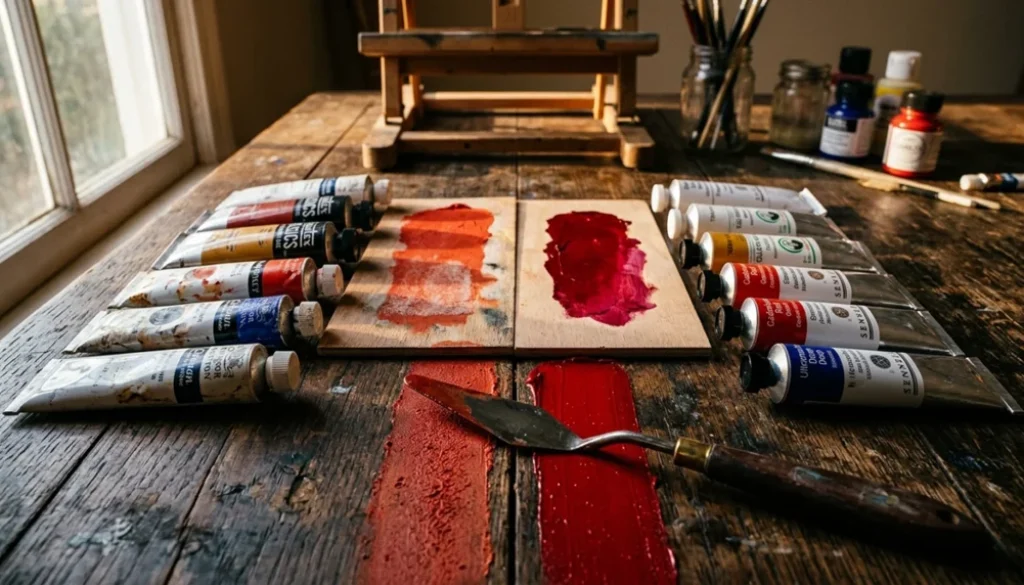
There are two things guaranteed to paralyze a painter in an art supply store: too many brushes and the student-versus-professional paint dilemma. Both tiers are sitting right there on the shelf, looking smug, and neither one comes with a helpful label that says “buy me if you’re actually ready.”
So let’s settle this properly.
The Real Difference Between the Two Grades
“Student grade” doesn’t mean it scraped through on a D-minus. And “professional grade” doesn’t mean your paintings will suddenly look like they belong at the Met. The gap between them is more specific and more interesting than the marketing suggests.
The core distinction is pigment load: the ratio of actual color pigment to the binder, filler, and extender used to carry it. Professional paints pack in significantly more pigment. Student paints compensate for less pigment by adding inert fillers like calcium carbonate or marble dust, which add body and workability without adding color strength. Here’s the key part most people miss: the same quality pigment is often used in both lines from the same manufacturer. You’re usually getting less of the same thing, not a worse version of it.
There’s a second difference worth knowing. Professional-grade paints grind their pigments into finer particles, which produces smoother results and noticeably better luminosity, especially in glazing and fine detail work. On a large blocked-in canvas? You’d never notice. In a layered portrait or a detailed botanical? Night and day.
Key Differences at a Glance
| Feature | Student Grade | Professional Grade |
|---|---|---|
| Pigment load | Lower, more filler and extender | Higher, more pure pigment |
| Price | Uniform per tube, lower overall | Varies by color series; can be 2–5x more |
| Color range | Smaller selection | Wider, including rare and specialty pigments |
| Mixing results | More prone to muddy, unpredictable results | Cleaner, richer, more predictable |
| Color shift (acrylics) | Greater shift when drying (white binder effect) | Minimal shift (clear binder, more pigment) |
| Coverage | Less, you use more to achieve the same effect | Better coverage, less waste |
| Lightfastness | Depends on the specific pigment, not the grade | Depends on the specific pigment, not the grade |
| Hues vs. single pigments | More “hue” colors simulating expensive pigments | More true single-pigment formulations |
| Archival suitability | Fine for learning and print reproduction | Recommended for selling originals |
What “Hue” Colors Actually Mean (And Why They’ll Drive You Crazy)
One of the sneakiest differences between grades is the prevalence of hue colors in student lines. A “Cadmium Red Hue” is not Cadmium Red. It’s a cheaper pigment blend engineered to look like cadmium red straight out of the tube, but the moment you start mixing, all bets are off. It behaves completely differently from the real thing.

If you see “Hue” anywhere on a tube, treat it as a flag: that color is being simulated, not replicated.
This matters enormously when you’re learning color theory, because your mixed results won’t match what instructors and textbooks predict using true pigments. You’ll think you’re doing something wrong when the paint is actually just doing its own thing. Professional lines carry far more single-pigment formulations, which is why color mixing becomes cleaner and more predictable when you switch.
The Lightfastness Myth (More Complicated Than Anyone Tells You)
Here’s a widespread belief that needs correcting: professional paints are not automatically more lightfast than student paints.
Lightfastness is a property of the pigment itself, not the grade. If the same pigment (Phthalo Blue, PB15, for example) appears in both a student and professional tube, both will perform essentially the same over time. Grade is irrelevant.
That said, there are two legitimate lightfastness concerns tied to grade:
- Student lines frequently use less stable pigments in certain colors, cheaper colorants like Alizarin Crimson (PR83) or some lemon yellows (PY3), where professional lines substitute more stable alternatives. The fix is simple: read the pigment code on the tube, not just the brand name.
- Student paints often omit or obscure lightfastness ratings entirely, making it impossible to know how a color will hold up in 20 years.
If you sell original work that will hang on a client’s wall for decades, this data is non-negotiable. If you scan your work for prints? Less critical. The longevity of a print depends on the print materials, not the original paint you used.
When Student Grade Makes Total Sense
Student paint gets an unfair reputation. Here’s when it’s not just acceptable, but genuinely the smarter choice.
You’re a true beginner (first year or so). The goal right now is building muscle memory, understanding how the medium moves, and burning through paint on practice. Investing heavily in professional supplies before you know what you actually need is just expensive guessing. Get comfortable with the medium first.
You’re doing underpainting or blocking in large areas. Many experienced artists deliberately use student grade for their first layers, reserving professional paint for the final detail work. The performance gap at the underpainting stage is essentially irrelevant.
You’re running color studies, thumbnails, or technique experiments. These don’t need archival permanence. Student grade is perfect here.
Budget is a hard constraint. A reputable student-grade line (Winsor & Newton Cotman for watercolor, Winton for oil, Van Gogh oils or watercolors, Liquitex BASICS for acrylic) will let you paint consistently and build real skill. Painting regularly with good-enough materials beats painting occasionally with perfect ones.
Some pigments are actually easier to control at student grade. High-intensity pigments like Phthalo Green and Dioxazine Purple can be overwhelming in professional concentrations. Some experienced artists buy the student version of these specific colors on purpose, because the lower pigment load is easier to manage in mixes. Sometimes “less” is exactly right.
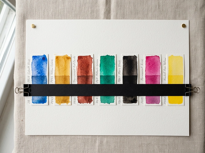
When Professional Grade Earns Every Extra Dollar
You sell original artwork. Clients paying for originals are buying something they expect to last. Lightfastness data, predictable behavior, and archival stability are part of what they’re purchasing. Using student grade on commissioned work is a reputational bet you don’t want to make.
Your color mixing is consistently frustrating you. Student-grade paints, with their filler content and lower pigment load, are genuinely prone to producing muddy results when you try to build complex mixes. If you’re painting skin tones, atmospheric landscapes, or detailed botanical work where precise color relationships matter, professional paints give you meaningfully more control.

You work in glazing or transparent layers. Glazing (building depth through thin, transparent layers) requires pigment that disperses evenly through the medium. Student-grade paints often don’t have the pigment density to hold in transparent applications; they “break” and go chalky or uneven. If glazing is part of your technique, professional grade isn’t a luxury, it’s a functional requirement.
You’re burning through tubes faster than expected. Here’s the counterintuitive math: because student paints have less pigment, you physically use more of them to hit the same color intensity and coverage. For colors you use constantly, professional tubes may actually be more economical per square inch of painted surface. Run the numbers before assuming the cheaper option is cheaper.
Your skills have outpaced your materials. This is the clearest signal of all. If you’re consistently unable to achieve a specific effect and you’ve genuinely ruled out technique as the cause, your materials may be the ceiling. Inability to achieve clean transparent washes, rich glazes, or vivid saturated mixes despite solid technique is often a student-paint limitation, not a skill gap.
The Hybrid Approach: The Smartest Way to Transition
You don’t have to make an all-or-nothing call. The most practical strategy (and the one most working artists actually use) is a deliberate hybrid: professional grade for some colors, student grade for others.
The logic is straightforward. Some pigments are inexpensive to produce and perform nearly identically across both grades. Others show dramatic quality differences and are also the ones most likely to appear as “hues” in student lines.
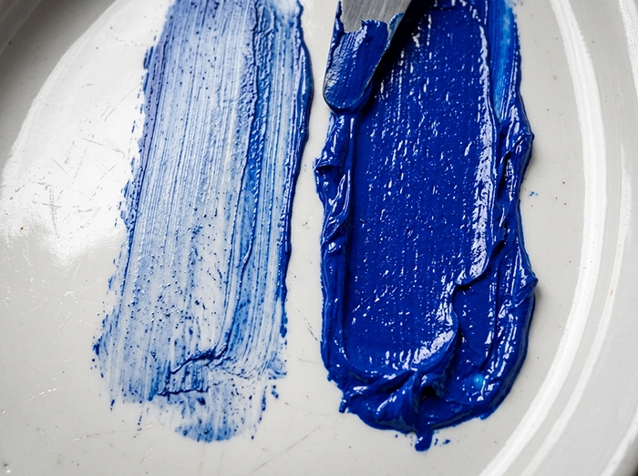
A practical upgrade path:
- Start with professional-grade Titanium White. It gets mixed into everything. Upgrading this one tube improves every color you lighten, immediately.
- Then upgrade your primary triad. One red, one blue, one yellow in professional grade will transform your color mixing quality while keeping costs manageable.
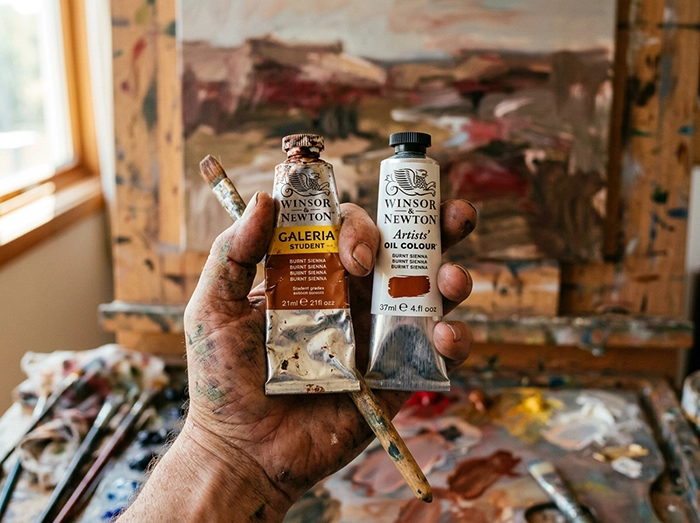
- Stay student grade on earth tones for now. Burnt Sienna, Raw Umber, Yellow Ochre are inexpensive to produce, widely available in quality student lines, and the performance gap between grades is small.
- Replace as you run out. Rather than buying everything at once, finish a student tube then replace it with the professional equivalent. This spreads cost over time and gives you a direct before-and-after comparison, which is worth more than any review you’ll read online.
- Spend on better surfaces, always. Many art educators argue that paper and canvas quality matters more than paint quality, particularly in watercolor. Professional paint on cheap paper underperforms student paint on excellent paper. Surface is the foundation everything else is built on.
Recommended Brands by Medium
Not all student-grade paints are created equal. Some “student” lines from top manufacturers rival lesser professional brands in actual performance.
Watercolor
- Winsor & Newton Cotman — the benchmark student watercolor; consistently reliable, wide availability
- Van Gogh Watercolors — above-average pigment load for the grade, excellent value
- Sakura Koi — solid for absolute beginners and portability, limited serious color range
Oil Paint
- Winsor & Newton Winton — smooth, creamy consistency, 55 colors, reliable for building skills
- Van Gogh Oils — popular with instructors for bright, creamy handling
- Utrecht Studio Series — large tubes at low cost, great for high-volume practice work
Acrylic
- Liquitex BASICS — consistent, widely available, trusted student acrylic
- Golden (student lines) — respected manufacturer whose quality standards carry through the range
Professional Grade Worth the Investment
- Daniel Smith (watercolor) — exceptional range, strong single-pigment offerings including their PrimaTek mineral colors
- Winsor & Newton Artists’ (watercolor/oil) — the classic benchmark
- Michael Harding (oil) — particularly loved for glazing work; exceptionally pure pigment load
- Golden Heavy Body (acrylic) — the industry standard for professional acrylic work
The Signals That Tell You It’s Actually Time
Forget upgrading on a milestone or a calendar. Upgrade based on demonstrated need. These are the reliable signals:
- Color mixing is producing muddy results despite consistent technique
- You’re working in glazing or transparent layers and paints are breaking or going chalky
- Original work is being sold or shown, and longevity now matters
- A specific color you rely on is only available as a “hue” substitute, and it’s limiting your work
- Your subject matter demands color accuracy (portrait skin tones, florals, precise atmospheric work) where predictability matters
- You’re going through student tubes unusually fast because of poor coverage
One important caveat: if you switch to professional paint and you’re still not happy with your results, the issue is almost certainly technique, not materials. No paint, regardless of grade or price, compensates for a skill gap. That’s not a criticism; it’s useful information, because it means the solution is practice, not a credit card.
Match Your Materials to Your Actual Situation
Student grade is a legitimate tool at every experience level for the right applications: practice, underpainting, large-scale work, and budget-conscious projects. Professional grade earns its premium when you’re selling originals, working in techniques that demand high pigment density, or when unpredictable mixing is actively capping your work.
The most efficient path forward isn’t a sudden wholesale switch. It’s a deliberate, color-by-color upgrade guided by real frustration and real need. Buy the best paint the specific situation demands, and let your skills and goals lead the investment rather than the label on the tube.